
Really like the fast flashy style of the opening sequence along with the fast editing and cutting. The whole film is filmed like this, My eyes find things like this visual pleasing and exciting as where a lot of people would find it too busy and annoying. personally i'd rather look at this than a piece which is soothing a calm as it is a lot more interesting.
Monday 13 December 2010
Wednesday 8 December 2010


Book range.


A simple publication design using a range of colours and a nice little belly band to hold them together. Something to consider for my RA10 brief.
ARTING - brnading


Again love the tech specs of the logo which is something i want to learn more about and delve deeper into but the best thing about this logo and branding is the colours used just slightly changing black for grey against the orange really makes it look more professional and thought about.
Also really like the type face used on the middle picture think it must of been design for the client, again something that i am interesting in producing.
unibrand - branding


A great example of a custom design type face logo here and a simple logo shape that goes with the typeface.
Signatur Gruppen Branding.


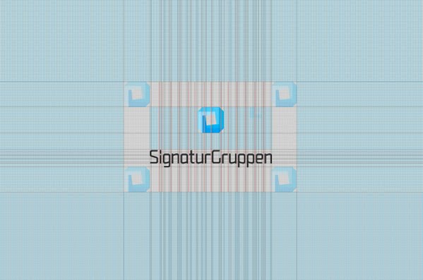


A good look into commercial branding and the kind of quality needed for this kind of sector. Love the Colour pallete created in a info graphic style really works and looks great.
Something to consider when presenting a branding brief.
Branding Street-hearts.


A more personal approach the branding here creating a less corporate look and feel. Love the black on black business cards and the context product shot.
Branding-Mostech.


Good range of stationary products produced here ,strong identity through colour and slapping the logo over everything, looks very corporate but still quite fun and contemporary.
Nice Business cards.


Just some nice finished business card i found again clean and 2 colour seems to be the best in terms of legibility and aesthetically.

Just a picture of Martyn W and Alex W.

This logo represents the chasing of your tail within the graphic design industry i think..... or is it just the recycling logo being invented.
Oblong business cards

Again clean simple and effective with a nice print process. Defiantly interested in print process within a industrial environment but not that keen on bespoke print process's that to me say more 'Arts and Craft's rather than Design.
Love the colour palette as well 2 colour nearly black and white but not quite.
Panasonic

Again a simple but most effective design idea, think I need to start looking at more stuff like this is activate the ideas part of my brain and maybe a sketch book with my ideas and others that inspire me.
People love music

A practical solution to a range........ change the colour probably the best way to create a range of product and the easiest.
The cd package is clean and the information that is need is all there and nothing else. Just the way it should be.
The Promise Ring

Really old cd i have but forgot how nice the cover was, apart from that i have nothing academic to say about this apart from.
Music covers are not graphic design, they do not communicate anything, they have no purpose in that respect.’
– Peter Saville

Mono Printing

Saw this picture but couldn't find any more of the actual book that was printed using mono printing. Just got me thinking about some stuff i did i while back that could be used within future briefs in terms of print methods. So that i can do these kind of techniques i need to plan out more so it gives me time to actually finish the product as well as design it.
LOUD


Love the simple and ambiguous style art direction that is going on here the simple repeat pattern can be used over a range of products and also in terms of longevity i.e changing the colour palette for future release's.
More dutch design as well.
Neubau business card

Love the type layout on this and the fact it's actually made from a piece of sand paper to destroy your wallet and whatever else comes within it's path. It has given me ideas for producing my new business cards in terms of materials used and layout out style.


Landrover-Onelife.


HAVE YOU SEEN THIS TYPEFACE?
I dont know what i'd use it for probably just write my name in it but i want it!
Think it could of worked well within the resident advisor brief to meet the contemporary, edgy, tecky route i was going for. Really like this publication in terms of layout and art direction. I'd defiantly be happy working on a project like this. The purpose of this publication in my opinion is to sell land rover as a contemporary lifestyle rather than the stigma of farmer car that land rover have had for many years. I think it does it's job well, the design direction is much more suited to the younger more fashion conscious audience rather than the functional farmer stuff.
Subscribe to:
Posts (Atom)