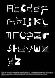
Tim Fishlock
- Again using shape to create letter form and even everyday objects such as office equipment or paper. This is something i could look into rather than just using shape and illustration to create type as image.

Richard Peacock
- Using negative space and inverting type can often create a interesting look, often resulting in something that looks like a image rather than a typeface. This is also something i will investigate when designing.

Phil Sheffield
- Rather than using print to produce the poster, Phil Sheffield has used a process of cutting out and placing the image creating a 3d tactile poster rather than your average edition screen print which is present a lot.
Using This process or a similar one will maybe make the poster more sellable due to the amount of craft that has been involved with the making process of the product, this also means that the product can be editioned similar to a screen print making the item bespoke.
Perhaps this is something that could be introduced in to the development part of the brief and start to use a number a print process ( or similar) to create a more desired item.

MARKUS SCHAFFER
- Using shape to create logo type/ legible type forms , again something i think will suit my audience in terms of aesthetics. I have to remember that these posters are being designed to be hung within a home rather than in a commercial environment.


Hort
- This approach of type as image is again something that will influence the way i design, I feel the atheistic of these products and design will suit the target audience i have described in the brief. It has a more illustrative element which could be linked with graffiti etc which ties in with the culture of electronic music in the form of hip hop and other forms of music.
I will also use the way the letters have been created using shape to influence my design work.

Chris Clarke
-Some more similar use of type at the top as the work of amy wicks with a more traditional typographic approach, but also some work which is dealing with the legibility and shape form of type. I emailed chris for a portfolio as he is a freelancer and he was nice enough to email me back with a PDF.

APELOIG
- Again this work is not as obvious as the work below but i still think the way the typefaces have been edited/ created makes them seem more like image rather than just strict legible type that is meant to be read as a sentence/paragraph etc. Some thing else that is present is the way the top poster work as a set and each have visual consistency through the set, changing the background colour to distinguish each one from another along with the layout of the type.


.JPG)

No comments:
Post a Comment